Close Menu
Awesome Inventions
    Facebook X (Twitter) Instagram Pinterest
    Facebook X (Twitter) Instagram Pinterest
    Awesome Inventions
    Sunday, November 30
    • Arts & Creative
    • Architecture & Design
    • DIY & Gardening
    • Products & Technology
    • Latest Posts
    • More Topics
      • Animals
      • Food & Drink
      • Funny
      • Health & Beauty
      • Parenting
      • People
      • Travel
      • Video
    Awesome Inventions
    Home » Uncategorized » 15 Well-Known Logos With Hidden Meanings You Didn’t Know About
    Uncategorized

    15 Well-Known Logos With Hidden Meanings You Didn’t Know About

    mcdonalds logos
    Share
    Facebook Twitter Pinterest Tumblr Reddit LinkedIn


    Company logos are part of every day life. We are so immersed in them being everywhere around us that we often don’t even take time to notice them anymore. Here we look at 15 of the most recognizable company logos on earth and find out the real story behind them. Forget those crazy sensationalist articles on bizarre meanings behind company logos and find out the truth here!


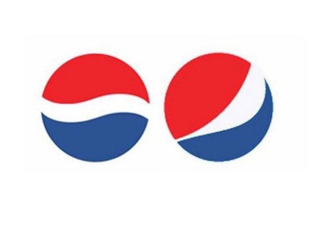
    Pepsi spent $1 million in 2008 coming up with their new logo (on the right). Arnell Associates came up with the design and a leaked document says that they drew upon the theory of relativity, the geodynamo of the earth, Feng Shui, the Renaissance and more to come up with the design. Wow.

    pepsi logos
    bobrinderle


    The three ellipses in the Toyota logo are supposedly representative of three hearts. That of the customer,  that of the product and of the heart of progress.

    toyota logo
    cartype


    The blue and white on the BMW logo are representative of the colors of the Bavarian Free State. Using a national symbol as a commercial trademark was illegal at the time the logo was created so the colors were put in a different order.

    bmw logo
    logostage


    The blue of the Mobil logo is representative of fidelity and security whereas the red is symbolic of strength.

    mobil logo
    brandprofiles

    The V and W of the Volkswagen logo stand for ‘Volks’ which is German for ‘people’ and ‘Wagen’ which means ‘car’. So basically this is a car for the people!

    vw logo
    lifo

    NBC created this awesomely colorful peacock logo to adapt to the new color TV technology developed by their owner RCA way back in the 1950’s!

    nbc logo
    wikipedia

    The tri-star of the Mercedes-Benz logo represents the company’s strong presence over sea, land and air.

    mercedes benz logo
    cartype

    The Google logo is made up of four primary colors in a row which are suddenly broken up by a secondary color. This is because Google wanted to illustrate that they are fun and they don’t play by the rules.

    google logo
    blogmost

    These four hoops represent the founding members of the Auto-Union Consortium in 1932 – Audi, Wanderer, Horch and DKW.

    audi logo
    zeroto60times

    The McDonalds ‘Golden Arches’ really are just the letter ‘M’ – nothing more and nothing less. Interestingly though, way back in the 1960’s McDonalds were considering changing their logo however psychologist and design consultant Louis Cheskin declared that customers equated the logo with a “pair of nourishing breasts” and advised that it should not be changed!

    mcdonalds logo
    justpicturesandphotos

    The Adidas logo is actually representative of a mountain and overcoming obstacles!

    adidas logo
    famouslogos

    The white lines which pass through the IBM logo are representative of the equal sign in math and are all about equality.

    ibm logo
    AAJTech

    The famous Apple logo represents the forbidden fruit from the ‘Tree of Knowledge’.         

    apple logo
    deviantart

    You might think that the Amazon logo just contains a smiley face however you may also notice that the arrow is pointing from the a to the z. Basically Amazon is letting us know that they have tons of items for sale, everything from A to Z!

    amazon logo
    amazon


    The arrow which is situated between the letters E and X is representative of the forward thinking and progressive attitude of the company.

    fedex logo
    stradegy

    This post may contain affiliate links. Learn more.
    Share. Facebook Twitter Pinterest Tumblr Reddit LinkedIn
    Previous Article10 Awesome Backyard Bars That Will Inspire You To Build Your Own
    Next Article Father Photographs His Three Daughters And With The Help Of Photoshop The Results Are Fantastical

    Related Posts

    We Asked AI To Create Some Really Cool Things And The Results Did Not Disappoint

    Retired Baseball Player Blake McFarland Creates Beautiful Resin And Wood Animal Sculptures

    Fashion Designer Bibiana Berenguer Creates Beautiful Dresses Inspired By Butterflies

    A Dog Bunk Bed Is A Stylish Way To Save Space In Smaller Homes

    Artist Konekono Kitsune Creates Embroidered Versions Of Vegetables That Look Like The Real Deal

    Artist Alireza Karimi Moghaddam Creates Colorful Illustrations Inspired By Van Gogh

    19 Creative Ways To Make Your Office More Organized

    Uncategorized

    Do you find yourself rummaging around your desk looking for things, buried alive by your own…

    Basement Of Luxury Hotel Contains World’s Largest Intact Mosaic For All To See

    Art & Creative

    In 2010, a construction crew made an astonishing discovery while digging the foundation for a…

    These Awesome Sweater Wearing Tortoises Are Just Too Cute

    Uncategorized

    We all love dressing up our pets and cooing over how adorable they look.…

    Super Easy Hairstyles For Super Busy Mornings

    Uncategorized

    Getting out of bed often feels horrible. You cherish every extra minute you can get.…

    © All Rights Reserved - Awesome Inventions
    • Awesome Inventions
    • Privacy Policy
    • FAQ
    • Advertising / Promotions
    • About Us
    • Contact Us

    Type above and press Enter to search. Press Esc to cancel.